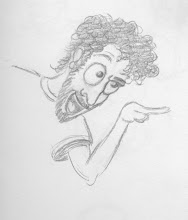
So I've been putting off some cartoon training to learn some of the powerful programs that I'll need to make cartoons!
Trying out some outer space backgrounds with Photoshop!
These are a lot more realistic than what you'd probably see in a cartoon. I've been using online tutorials to get an idea of how people are able to create these types of views so easily and quickly just to get a better handle on these vastly powerful programs. The online community is pretty good about sharing info thankfully! It's with these basics that I hope to adapt and create backgrounds with my own flair...
By the way.. Still working on the cartoon.. among the many other little projects I'm doing.. Need to make a deal with Father Time and get him to freeze things up for me!
Thursday, July 7, 2011
Monday, April 25, 2011
Tuesday, March 29, 2011
Sunday, March 6, 2011
Workflow
Friday, October 15, 2010
The Inevitable
I did this only a few days after doing the dancer from the last post, but I've been so busy with work that I just haven't had time to put anything up, or draw many new things for that matter. I'm definitely surprised at how much better this came out than I originally thought. Seeing them side by side is a really good exercise for pointing out where I'm making my mistakes. With this guy there are pretty much only proportion errors that I can see. Though his cheeks are the correct size, his skull is a little smaller than Preston's. The hat isn't tipped as far forward in mine either. That's an important detail for looking like a tough guy. I made the arm and hand holding the nightstick too big and the other arm a tad too short. The whole body in general is slightly smaller than the original. The buttons are smaller on mine (left pic) and don't wrap around the body as neatly as the original (right). The belt buckle is bigger on mine and the shoes are smaller. The eye's on my drawing aren't as beady either. I still think it's a successful drawing despite the proportion problems. I give myself a 'B' for this one.
And so here is the inevitable. It was only a matter of time before I took a shot at a John K. design. This was definitely a hard one. Again, a lot of the proportions are off. Proportion seems to be my nemesis. The head on mine is too small. The body is too large in proportion. Also, some of my construction is off here which is frustrating. Ren's head is sort of jelly bean shaped in John's and pea shaped in mine. The nose is too stiff on my drawing and not floppy like the model. The lips on mine lack that sagging look and the whole thing seems stiffer than the model. I am happy with how the hands and feet turned out with mine. I'm surprised it came out as well as it did considering all the subtlety John K. can put in to a drawing, but then again I guess he's been doing it a lot longer than I have. C+ on this one.
So the journey continues. I think I need to move to a new phase in this learning process which is picking a character and learning to draw him/her in my own poses and I think that character is going to be Donald Duck. Donald has been a big inspiration to me during this time of learning; so much so that I've dedicated my latest sketch book to him, naming it "Oh phooey!" His cartoons are possibly my favorite to watch of all cartoons. The writing combined with the beautiful animation are hard to top by any standards. I especially enjoy how his subconscious can take hold of the plot and guide what we see and experience through his eyes.
Rocko, from Rocko's Modern Life, is another highly inspirational cartoon and I plan to do some studies of his construction as well.
See you then...
Wednesday, September 15, 2010
One Word:
H-A-R-D!
This was a hard drawing to accomplish, plain and simple. There's so much subtlety and technique that needs to go in to a drawing like this. It came out better than I expected it to, but there's one part that I knew I probably wouldn't get right when I started and my suspicions were met. Damn those curvy stems!
I've never been very good at knees and legs in general. I never get the proportions right and the knees always seem lumpy in the wrong places. I should do some straight up knee and leg studies, ankles and feet included. I think there are also places where I could have exaggerated features more; in the hair; in the floofy bottom of the dress.
The biggest problem I have with my drawing (left) is that it looks like the dancer should be leaning on a chair or something rather than taking a step with the front leg as in the picture from Preston Blair (right). I think it came out that way in my drawing because I drew the hips more tilted than they are in Preston's. That, of course, set off all the anatomy below them. The knee of the front leg looks a little hyper-extended and the back leg looks as though it isn't quite pushing off for the next step. Ah, but this is what practice is for, yes? Also, the bow is bent on the one side in mine.
I give myself a B on this one. I might try something a little easier next time. Oh, and I'm going to try and update more often with less material. I'm using my lunch periods at work to get these done. Usually I can bang one out in 2 days, but this last one took me over a week! Well, until next time.
Sunday, September 5, 2010
Lots of Preston Blair Studies
Seeing as how Donald has been one of my biggest influences during this time of great cartoon study, I figured I'd start this post off with him. Here's a comparison of my drawing (left) next to the one from the model sheet (right). The one thing that pops out to me the most in my drawing is that the front leg is too small. The foot is small and the leg is too skinny compared to the model sheet. Some little more subtle differences: Donald is holding his hat slightly lower in my drawing and the eyes are the same size in my drawing. There's a little more perspective in the model sheet. You may notice the farther eye is smaller as would be normal. Other than that, a pretty successful drawing.
Here are some more unfinished Donald heads taken from the model sheet. At some point, I'll start doing my own expressions and poses. I think the hardest part about Donald's head is the bill. Getting the proportion and curves to look correct is always a challenge.
Here are two key drawings from the Preston Blair book. The Gander Goose drawing isn't as developed as the Rowdy Rabbit one is. These drawings were actually done earlier than all of the Donalds. I'm finally starting to get a better understanding of line of action by doing the full body poses. I'm still lacking in comparison to the book drawings; however, I have to say these drawings are looking solid.
Here are some different animal drawings, all from the Preston Blair book. The cat drawing is taken directly from the line of action page. I'm finding that I might benefit from getting a bigger drawing pad. I like the mobility of the 9"x12" pads, but as you can see they are getting a little too small for my drawings. Some of these drawings are perhaps even older than all the others so far. The elephant is more recent. I was working on using the skeleton sketches to lay out the character pose. This is definitely not as easy as it seems. Also, I haven't really been completely finishing these drawings so I'm trying to do more of that. The first Donald drawing reflects that as will the following.
Here are some human cartoons. These characters can be a little harder to draw because you often need more shapes to make up recognizable face and body. More shapes = more complex. The first is a study from the Preston Blair book, a very appealing showgirl whose subtleties are quite hard to capture. The second is study of Elmer Fudd that I pulled off the net from somewhere. Again, these are unfinished and kind of sketchy.
I'm really happy with this one. It belongs to the set of newer drawings, including the first Donald drawing on this post. It's a frame from the fast run cycle in the Preston Blair book. I'm thinking of drawing the other three in the cycle and throwing it in to Flash just for shits and giggles, but I might have to get a light box for that. I'll at least have to add reference marks on them all if I do it.
Lastly, here are a couple examples of principle application to my own characters along with some experimentation. I really like the long necks in the first one. I'm not sure how I ended up doing that or why it works for me so well, but I'll be sure to play with that a bit more. The sexy looking lady on the right is another from the set of newer, completed drawings. I've been trying to keep the construction pretty basic for all of my human characters so they'll be easier to animate for my cartoon.
Speaking of which, here's a little news on the cartoon. Production has been slow, unfortunately. I got a new job this year, moved, shot a wedding video on the side and have been taking care of some other necessities as well. I'm learning it's harder to teach yourself a skill than go back to school for it, but I do find I'm progressing and things are finally settling down for me. I've been able to actually continue working on the storyboards and expect to start on the actual animation fairly soon! I'm going to go about it in sections. First, animate the extreme poses, follow those with the in-betweens and then move on to backgrounds. Lastly, I'll iron out any special details. Hopefully, it'll go like clockwork, but I've got a lot of work ahead of me.
Here's my favorite storyboard so far:
Stay Tuned...
Subscribe to:
Posts (Atom)