Sunday, April 25, 2010

The Quest for Appeal

So, I have thrown the metaphorical cyborg ape in to the gears of my drawing technique by entirely changing the origin of energy in my pencil. Sounds complex, yes? Well, too bad, it's not. What I really mean to say is that I started using my whole arm for drawing instead of just drawing from the wrist like I have for most of my life.

It's one of the downfalls of being and idiot and self-taught. I never really used references or studied the techniques of others much as I grew up and so my drawings were based only on my own understanding of drawing. Eventually, my drawings became stale and started to bore me. Thankfully, I woke up one day and started studying the cartoon techniques of some of my favorites (John K., Joe Murray, the old WB and Disney cartoons).

So anyway, using this new technique in combination with different hand grips on the pencil has proven to be challenging to say the least. It's also frustrating to suddenly suck entirely at something you have been doing for a long long time. So without further silliness, here are some humble beginnings... again...


I'll spare you the countless pages of misshapen circles and muscle memory exercises and skip right to the progress. I found that using my whole arm and loose grips give a lot more flow to the lines I draw. On top of that, I tend to use one flowing line instead of that "hairy/sketchy" look I would get from using a tight tripod grip and moving only from the wrist. It also makes drawing big a hell of a lot easier and more practical.


These drawings feel so much more cartoony than most of the drawings I've done in the past. I'm getting a better understanding of expression through these drawings and how the old WB cartoonists started developing their techniques through the 30's and 40's. You might notice that I'm focused mostly on women in these drawings. It's because I'm doing storyboards for my first cartoon and I came to realize that I can't draw cartoon girls to save my life. So I began a quest to start drawing appealing cartoon women. By appeal, I mean pleasing to the eye. With the right cartoon design, you could draw a zombie regurgitating putrid human remains and make it appealing.


Here are a couple of renderings of the character I based off of my friend Rob using the new drawing techniques. I especially like the second drawing. I don't expect that this will replace my design for the character in the cartoon, but it's possible that the design could evolve toward something like this as I improve with technique over time.


The girl in the cartoon is supposed to be pretty pissed off by what our main characters are up to. I was playing around with some angry faces, but it's gonna take some more practice I think as these are all pretty shabby and unappealing.


This is the first design that I really liked and found appealing. This one felt like a step in the right direction and the following were developed from it.


This was my first girly body design which came out a lot better than I expected it too, probably due more to luck than talent. I used a lot of references to come up with this. I like making the hips extra wide because it looks more natural. I like curvaceous girls. The popular thing in Hollywood at the moment is to look like you've been starved in a cage that was left on the beach for 8 weeks and personally, I think it's disgusting. I like a girl with voluptuous curves and a little meat on her body. It's just natural and healthy dammit!


UH OH! NAKED ONE COMING UP!! YOU'VE BEEN WARNED...


I look at this and immediately notice the hips should be wider. I also wonder if I'm making the heads way too big on all of these drawings, but the appeal remains for me even if I am; it's more so in the last drawing than this one. I was mostly focused on drawing nice, shapely legs in this one, but again, the hips definitely are not wide enough.


Lastly on this topic, I tried my first pose. Once again, it turned out pretty good for not having a good grasp on what I'm doing yet. The legs turned out kinda meh. I'm going to have to do some more referencing for that I think. I like the torso and the head though. Again, I'm wondering if the head is too big, but the hips are supposed to be further away and the head is supposed to be closer. I think the perspective might still be a little funky though. Anyway, I think these have some appeal and the quest shall continue. In the meantime, here are some storyboards from the cartoon!


K: What do you wanna do, Rob?


Good cartooning is hard. I really want all aspects to be entertaining and amusing. Funny writing is great to have, but if the visuals are bland and generic, you've only done half of your job. I didn't really understand any of this until I started reading John K.'s blog and studying the old drawing principles on ASIFA. If you're interested in this stuff, I implore you, check them out for yourself!

http://johnkstuff.blogspot.com/

http://www.animationarchive.org/


That's all for this one! See you next time..

Thursday, February 25, 2010

Alrighty! Finally and update!

Whoa! Finally found a way to update without a scanner... i.e. digital camera! Sweet!


Most of these are made up drawings, not from any reference. I like the super happy guy at the very top. The fat guy in the middle looks hilarious, so I love that one. The big one of Donald on the bottom is from a model sheet reference. I think it turned out pretty good. I need to do some comparisons soon.

Here are some more non-reference drawings. The fat guy with another expression turned out better than I thought it might. I tried using my own construction for him in different expressions. The devil guy was another one of my own. That one was about wrapping details around the head. As was the really scared/embarassed guy on the bottom right. I'm not really sure what expression that's supposed to be.. That's bad.. The Donald is again from reference. Not bad.

Some not so impressive personal constructions. The big Donald is my own attempted expression based on memory of the referenced small Donald at the bottom which I drew second. He's laughing a lot harder in my memory attempt.

Here I started moving towards drawing more female heads which I realized I hadn't done much of yet. What I really need to do is do more body constructions. These females turned out kind of okay though. The important aspect I was going for here was appeal...

These sexy lady drawings were from reference in the P. Blair book. The one at the top I did last. That's probably why it looks the best. This is a hard subject.. this character has a lot of very subtle squash and stretch in her features as she sings. Hardest of all was capturing the seductive look of every movement. My drawings don't really do justice to what's in the book.

If you don't get the look from the eyes right, then the appeal is totally lost. You can see it in my first drawing at the right. It was also interesting to come to understand the construction of this character. Even after my last drawing at the top I still don't feel like I have it down perfect. The hair was a bitch to get right also. Eventually, I'd like to do a few full body drawings. Should be a good challenge..

So I feel like I'm starting to get a good handle on drawing solid heads. It's time to draw some more full body figures. Til next time!

later!

Wednesday, December 9, 2009

There will be more!

Cartoon update coming as soon as I can get my hands on a scanner!

In the meantime I took a picture with my webcam.. Muhahahaha!


Tuesday, November 24, 2009

Couple new things

So I'm working on a reality tv show right now, so I'm finding it hard to find time to update while working 12 hours a day! Anyway, I'm trying to draw during whatever down time I have during the day. Also, I finally got a copy of the Preston Blair book from a very awesome person... You know who you are.


So first up are some Squash and Stretch sketches from the original Preston Blair book. (The new one has new drawings which I have.) A lot of these are not bad. I'm finding that my biggest foe in drawing these is proportion so I'm going to try and find some exercises to work on that.


These drawings are some of the new ones... I think the one at the top left is the best drawing I've done with the Preston Blair practice since I started. The proportions turned out good and the lining and clean up turned out really nice. I was smart enough to draw these all a lot bigger than I normally draw which was helpful as well. The other two turned out pretty well also, although they are unfinished. I need to start putting up more comparison blogs now that I have so many drawings. Next up I hoping to compare the Donald Duck drawings from my previous posts.


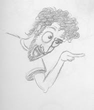
Here's a little treat. It's a cartoon based on myself. I'm hoping to be able to use this as a basis for the cartoon I'm planning with the Rob character I've posted before.


This last one is a mish-mash of a bunch of different sketches. A lot of them are using the skull construction that I've been playing with. I also practiced some cartoon hands here and tried to do an angry Donald from memory. I think it turned out alright. The main attraction on this page was an attempt at a full body drawing of a character, the cat, that is. Drawing a full body cartoon character and making it look solid and correct is a lot harder than I expected it could be. I'm hoping that as I come to understand line of action this stuff will get easier.

Well, wish I had more but that's all for now. I'm gonna try to get those Donald comparisons up next time, but until then, here's the link to the page I found the Donald model sheets on so you can look for yourself if you're really that interested. Haha!

http://www.michaelspornanimation.com/splog/index.php?s=disney+model+sheets&submit=Search

Scroll a little bit more than halfway down the page and you should find it.

-k

Tuesday, September 15, 2009

More Donald and introducing some preliminaries...

So I've been doing some more Donald studies because it's a hell of a lot of fun. Hopefully it's not a bad idea, but I've started to develop a character of my own as go through the lessons, mostly for fun.


Here's some standing Donald poses... in all their awkward, unbalanced glory... I thought they were good at first, but then realized how off they were. You might notice that Donald on the left is sort of hanging forward a bit. Donald Right is drooping to the right a bit. The clean up was really messy on these too.


A bit of an improvement here. Donald is standing upright. A big improvement from the first in construction and line of action. However, my hand seems to be terribly unsteady when trying to line these. If you look at the close-ups it's more apparent. I need to find something to practice for that. Still, a good improvement.


This one didn't turn out too bad. My one major complaint is that I constructed the head too wide and hence his eyes are too far apart. The eye on the left doesn't look like it's attached in the right spot because of that. The line of action is pretty good, I think.. Body construction is pretty good too.


Now the really fun stuff.. These are the earliest preliminaries of a character based off of the Rob cartoon sketches I posted before. I did a bunch of sketches that I'm too ashamed of to put up here, but they helped me get to the next page.


So here's the first draft of the character from head on, side view and expression. The one from head on is probably the best of them. I like it the most. The one from the side looks like a South Park character and therefore needs to be changed. I just need to rotate his head and bit and do a 3/4 profile. The last one has a maniacal smile and a wily eyed look. But something is wrong about the nose. It seems to be in the wrong place or something.. Also, the points in the cheeks make him a little scary.. I'm not sure that was the intention.

Well, I'm going to be reworking these a bit and it will hopefully lead to a cartoon. Also I'm going to get back to doing the Blair lessons!

-k

Thursday, September 3, 2009

Comparisons #1

Ok, so I finally got together a comparison post. This took more work than I thought it would. This is lesson three from the JohnK/Preston Blair lessons.. Compare your work...


So I figure I'd start with this atrocious old woman...


This one's pretty painful to look at.. construction isn't great. The eyes are way too wide apart and look pasted on her head. Nose isn't long or crooked enough. the Chin is too long and the glasses are too tall. Eyebrows are in the wrong position too. I need to take another crack at this one...


I like how this wolf turned out. The construction is pretty good aside from some proportion issues. Also the ears don't point straight back like Preston's does and the eyes aren't stretched far enough. Lastly, the nose is too small on mine. Not bad overall though.


I thought this ram was a pretty good copy until I compared it. The head on mine is slightly tilted forward. The snout is pretty good, but the eyes aren't angry enough. Construction is pretty good though.


Again, mine is tilted slighty on the wrong angle and the head isn't tall enough. Good proportion on eyes, nose and ears. The mouth isn't as wide. Another not so bad copy.


This one's pretty good, only two complaints. Eyes are too small and so is the nose. Other than that pretty good.


Here's some sort of sexy mouse or something. Mine actually looks more feminine than Preston's, not sure if that was intentional. The ears are a little off on this one and again the nose and eyes are a little small.


What can I say about this one? The construction seems kind of shabby on this. The eyebrows don't seem to be shaped right nor do the jowels. Looks like Butch lost a few pounds in my copy.


I'm proud of this one because I feel like I really caught the feel of the character in my copy. There are some construction issues with it like the smaller snout and small ears, but I mostly like this one.

Well, that was fantabulous! Next up I'm gonna do some more of lesson 2 drawing and compare my Donald Duck drawings to the originals... Stay tuned!

Tuesday, September 1, 2009

Donald Duck and heads!

Ok so I was on JohnK's blog looking for inspiration and I caught this Donald Duck model sheet and couldn't resist..


I picked all of the harder head positions and did two expressions... The head positions were much easier than the expressions. Also, I tried drawing first with an HB and then attempted smooth, dark lining with a 6B. The clean up was a little messy for most of them. Especially the last expression. I probably looked a lot like Donald after drawing that. That expression is deceivingly hard.

Next, I'm going to move on to body positions for Donald so I can learn to draw him using my own poses.


A lot of this is practice with head construction. You'll note the Donald heads here as well. Another attempt at lining, this time with pen. I find that I don't have a very steady hand when trying to do this.. My strokes aren't relaxed and it shows.


So there's a few squash and stretch bits from lesson two of the animation course. I'm going to do more of those tomorrow. I really like the deranged looking dude. He was designed using the head and jaw construction and turned out pretty good. The hand is awful unfortunately, but it's still an exciting expression. The hand looks like it might fall off though. The generic cat is reminiscent of the Rocko stuff from the other day. Not super amazing..

I'll need to start doing the side by side comparisons for the animation course. Here's more info on that: http://www.animationarchive.org/2006/05/media-preston-blairs-animation-first.html

alright! back to drawing!

-da99et