Tuesday, September 15, 2009

More Donald and introducing some preliminaries...

So I've been doing some more Donald studies because it's a hell of a lot of fun. Hopefully it's not a bad idea, but I've started to develop a character of my own as go through the lessons, mostly for fun.


Here's some standing Donald poses... in all their awkward, unbalanced glory... I thought they were good at first, but then realized how off they were. You might notice that Donald on the left is sort of hanging forward a bit. Donald Right is drooping to the right a bit. The clean up was really messy on these too.


A bit of an improvement here. Donald is standing upright. A big improvement from the first in construction and line of action. However, my hand seems to be terribly unsteady when trying to line these. If you look at the close-ups it's more apparent. I need to find something to practice for that. Still, a good improvement.


This one didn't turn out too bad. My one major complaint is that I constructed the head too wide and hence his eyes are too far apart. The eye on the left doesn't look like it's attached in the right spot because of that. The line of action is pretty good, I think.. Body construction is pretty good too.


Now the really fun stuff.. These are the earliest preliminaries of a character based off of the Rob cartoon sketches I posted before. I did a bunch of sketches that I'm too ashamed of to put up here, but they helped me get to the next page.


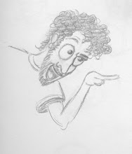
So here's the first draft of the character from head on, side view and expression. The one from head on is probably the best of them. I like it the most. The one from the side looks like a South Park character and therefore needs to be changed. I just need to rotate his head and bit and do a 3/4 profile. The last one has a maniacal smile and a wily eyed look. But something is wrong about the nose. It seems to be in the wrong place or something.. Also, the points in the cheeks make him a little scary.. I'm not sure that was the intention.

Well, I'm going to be reworking these a bit and it will hopefully lead to a cartoon. Also I'm going to get back to doing the Blair lessons!

-k

Thursday, September 3, 2009

Comparisons #1

Ok, so I finally got together a comparison post. This took more work than I thought it would. This is lesson three from the JohnK/Preston Blair lessons.. Compare your work...


So I figure I'd start with this atrocious old woman...


This one's pretty painful to look at.. construction isn't great. The eyes are way too wide apart and look pasted on her head. Nose isn't long or crooked enough. the Chin is too long and the glasses are too tall. Eyebrows are in the wrong position too. I need to take another crack at this one...


I like how this wolf turned out. The construction is pretty good aside from some proportion issues. Also the ears don't point straight back like Preston's does and the eyes aren't stretched far enough. Lastly, the nose is too small on mine. Not bad overall though.


I thought this ram was a pretty good copy until I compared it. The head on mine is slightly tilted forward. The snout is pretty good, but the eyes aren't angry enough. Construction is pretty good though.


Again, mine is tilted slighty on the wrong angle and the head isn't tall enough. Good proportion on eyes, nose and ears. The mouth isn't as wide. Another not so bad copy.


This one's pretty good, only two complaints. Eyes are too small and so is the nose. Other than that pretty good.


Here's some sort of sexy mouse or something. Mine actually looks more feminine than Preston's, not sure if that was intentional. The ears are a little off on this one and again the nose and eyes are a little small.


What can I say about this one? The construction seems kind of shabby on this. The eyebrows don't seem to be shaped right nor do the jowels. Looks like Butch lost a few pounds in my copy.


I'm proud of this one because I feel like I really caught the feel of the character in my copy. There are some construction issues with it like the smaller snout and small ears, but I mostly like this one.

Well, that was fantabulous! Next up I'm gonna do some more of lesson 2 drawing and compare my Donald Duck drawings to the originals... Stay tuned!

Tuesday, September 1, 2009

Donald Duck and heads!

Ok so I was on JohnK's blog looking for inspiration and I caught this Donald Duck model sheet and couldn't resist..


I picked all of the harder head positions and did two expressions... The head positions were much easier than the expressions. Also, I tried drawing first with an HB and then attempted smooth, dark lining with a 6B. The clean up was a little messy for most of them. Especially the last expression. I probably looked a lot like Donald after drawing that. That expression is deceivingly hard.

Next, I'm going to move on to body positions for Donald so I can learn to draw him using my own poses.


A lot of this is practice with head construction. You'll note the Donald heads here as well. Another attempt at lining, this time with pen. I find that I don't have a very steady hand when trying to do this.. My strokes aren't relaxed and it shows.


So there's a few squash and stretch bits from lesson two of the animation course. I'm going to do more of those tomorrow. I really like the deranged looking dude. He was designed using the head and jaw construction and turned out pretty good. The hand is awful unfortunately, but it's still an exciting expression. The hand looks like it might fall off though. The generic cat is reminiscent of the Rocko stuff from the other day. Not super amazing..

I'll need to start doing the side by side comparisons for the animation course. Here's more info on that: http://www.animationarchive.org/2006/05/media-preston-blairs-animation-first.html

alright! back to drawing!

-da99et